
 Chanel's opulent Paris-Byzance fashion collection was accompanied by a Byzance Makeup Collection for Fall 2011. Presented on the runway in December, 2010, the collection was inspired by the Byzantine Empire, 15 centuries into the past. Karl Lagerfeld took onlookers to to the banks of the Bosporus, at the heart of the Byzantine Empire, transporting them to a time when Constantinople was not yet called Istanbul. The extravagance of the Lagerfeld's designs was translated into the makeup collection.
Our first hi
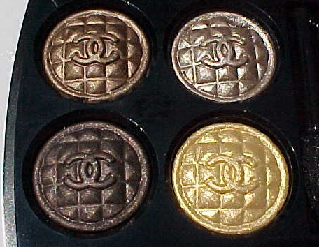
 nt of the makeup's "decadence" was the release of the Lumières Byzantines de Chanel Palette, a highlighter palette that I was privileged to receive, with a lot of help from my friends in France. Now, Collection Byzance de Chanel has arrived at Chanel boutiques and Chanel.com, and it's generating enormous excitement. Who can't summon an image of golden and colored mosaics or jewel-encrusted glamour?
The collection's theme, gold and rubies, perfectly echoes the ornamentation of Lagerfeld's designs. I nearly gasped when I saw the first photos of the collection, provided a few months ago by a Chanel boutique. I've been anxiously awaiting the arrival of the pieces, which hit the stores last weekend. At last, my anticipation was nearly satisfied. A phone call, a quick trip by FedEx, and the pieces I wanted were mine! I knew the ruby red lipstick and blush would be outside my comfort zone, and I seldom purchase makeup "just to have it." If I can't wear it, I can admire it from a distance - or on someone else. You can see the superbly edited makeup collection at this Chanel link.
What I did w
 ant were the limited-edition Rigard Signé de Chanel Quadra Eye Shadow in Topkapi ($65) and the limited-edition Joues Contraste Or Powder Blush ($43). I was thrilled when they arrived.
I took some quick photos yesterday to show you these treasures - even before I applied them. I wanted to share my excitement and let you know to order them quickly if you wanted any of the pieces. The collection won't be around for long. I'm sure the demand exceeds the supply.

The colors are lush. They enliven the face, similar to elegant jewelry at the neck or on the ears. I took swatch photos yesterday in full, afternoon sun. The highlighter was difficult for me to capture, primarily because the gold is light, perfectly light in my opinion. It illuminates, leaving a golden tint, but it doesn't shout loudly.
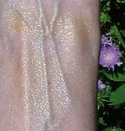
I applied it very heavily with a sponge-tipped applicator at the top of my arm to show you the hue - one with a hint of antique gold - and I used its companion brush, also heavily, to show you a more moderated view. I tried to hold my arm at an angle to the sun that wouldn't wash out the shade or add excess glimmer. I took photos in shade. I did everything imaginable to get good outdoor photos. These were the best I could do yesterday. If I can get better photos today, I will post them.

You can see that Joues Contraste Or sparkles in sunlight. It's not glittery. Rather, it reflects light, a quality you'll appreciate on your face.
The texture is very powdery for a pressed powder. On first use, you'll find powder inconveniently escaping its boundaries in the compact. I found that it stayed put once applied, perhaps binding to the oil in my skin (what little there is).
The highlighting powder is gorgeous. It works now for a golden summer look, but it will be perfect as fall turns to winter and we transition to the "dress-up months," when many of us delight in wearing a more ornamental look.
I had no tro
 uble getting intense photos of the Topkapi eye shadows in the quad. I applied each with a sponge-tipped applicator for maximum color, and swatched clockwise, starting at the upper left bronze in the compact's top left. As with the highlighting powder, I tried to capture my swatches at different angles to yesterday's strong sun.
The shades are shimmering bronze, shimmering taupe, sparkling gold (a gold that is similar to the Joues Contraste Or on my skin, but without the antique cast), and a satin-matte dark brown. Each of the shades is rich. I would never apply them to my eyes as heavily as I swiped them for the swatch photos.

On the lids, when applied lightly with a shadow brush, they vary in intensity. The gold is sheer and sparkling. The two shades I called shimmering, bronze and taupe, are extremely wearable shades. Different tones of brown, they can be paired for a rich chocolate look that summons fall clothing in my mind. My favorite, simply because of my fair coloring, is the shimmering taupe (second down on my arm). I could use a truckload of the shade!
The matte dark brown is best used as a liner on my eyes. It's a perfect complement to the other shades and ensures you can create a complete eye look with this quad.
I would call Topkapi a must-have. It's luxurious, as you would expect from Chanel and a special collection, one that offers a glimpse of the Empress of Constantinople and creates a desire to pull out the history books.
I took many more photos - may post them today on Twitpic if I have time. I'll leave a comment if I do. For now, if you want any of the pieces in this collection, get on the phone or in your car and head for the nearest Chanel boutique. If you have any kind of patience (or live too far from Chanel), the collection is available at Chanel's Web site. I find their shipping to be speedy.
Photos courtesy of Chanel and Chic Profile (does anyone know where Tavia went?) and by Best Things in Beauty